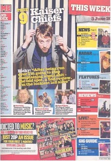
BRIGHT COLOURS! this contents page from the NME magazine is as we can see is very busy jam packed with images and loads of texts. we can obvious tell that the target audience is for a younger ages (16-25). by using the bright colours it makes the page more eye-catching and interesting . they also use a range of different colours , relating to different sections of the magazines . the colourful nature of this contents page subverts NME's original identity , they usually stick to minium colours which are usually dark colours.
The main image is of the member from the Kaiser Chiefs (Ricky) he is in the centre of the page but it is not a large portion of the page , his body posture and facial expression is very different as he almost hunched over and looking up at the camera , im not sure of what this conotes but it is very different to what NME usually portrays . the images on the side next to subheadings are very important , it draws the audience attention to what is going on with the magazine .
No comments:
Post a Comment