Tuesday, 26 April 2011

Evaluation Question 5

How did you attract/address your audience ?


On my front page , the main image i have taken has both artist looking directly at the camera , this is a use of direct address for the audience to feel involved and as if the artist are looking at them , luring them in to buying the magazine . Also the clothing my artist are in , they are both wearing red connoting power and superiority , Red being a bright color it catches the audiences eye . Making them look at the magazine and wanting to find out more . In addition to this , the background of this image is a graffiti wall , which relates  to my target audience and there r'n'b grime culture . 
The Typography i have used is a graffiti style font for the 'ROYALTY' subheading , this also links to my target audience and attracts them into buying the magazine , i used the color blue , as it stood against the red clothing , and also is very eye catching . For the mast head i stuck to black rectangular font with a blue stroke , this attracts the reader as it is easy and clear to read.


Looking at my contents page , it attracts and address the audience in many ways , firstly the main image of my artist and there clothing being bright color again engages the audiences . The female artist is wearing stylish heels which address a female audience , and a male audience . with the male artist is he fully color co-ordinated which attracts both female and male audiences . 

Evaluation Question 4

Who would be the audience for your media product?


Monday, 25 April 2011

Evaluation Question 3

What kind of media institution might distribute your media product and why?


a media institution such as Bauer might distribute my media product because it is an successful media distribution line which operates in 15 countries world wide . 

Evaluation Question 2

How does your media product represent particular social groups?


  • My media product consists of two Artist , one female and one male , Both of African/Caribbean origin . i believe my artist are depicted as very stereo typical , threw the way they are dressed in the magazine and the genre i have chosen . R'n'B and Grime are usually associated with black artist and black culture 
  • My Media product also represents youths of the modern age , come of the language used in the magazine for example in the double page spread 'yo yo yo ' colloquial language used relates to the stereotypical youth of today 
  • Also the bright colors used represent a more younger audience .

Evaluation – q1

Check out this SlideShare Presentation:

Thursday, 14 April 2011

Evaluation

Sammee, I'm not sure what the problem is but have you tried uploading you power point to slideshare? If you still have problems, bring in your power point evaluation on Tues 26th at 10am.

Sunday, 10 April 2011

MR MORRIS + MS PRINCE
im not being able to upload my evaluation pieces to my blog !
HELP -_-

Thursday, 24 March 2011

Final Contents Page

Front cover


This is my final Front cover page . i have made some little changes to this page , for example i stretched the image outwards to make the image look more suitable for the front page , as we can see below my models faces seem squashed . i also made changes to the Mast head . 'RNG' orginally i used a more circler shaped font with a black and white gradient fade .Observing my front cover i decided to change my style of font for the mast head more rectangular and solid black colour with a blue stroke effect , sticking to culture of Rnb magazines . Also in the subheadings ive used the names artists witch where originally hi-lighted with a yellow stroke effect i have now changed it to a aqua blue again tying in the image of the genre. 


This was my original idea for my front cover.

Sunday, 6 March 2011

Sketches for my contents page.

 Front cover 1


Outline of ideas 
- both female and male artist standing together
- image in line with masthead
-additional cover lines
-puff
-The Masthead : Rhythm + GRIME . 'Rhythm' Written in swirly flowing handwriting font . 'GRIME' will be written in block capital.
-colour palette will be black + grey with bright smooth sleek colours.
- male model will wear urban styled clothing to justify the grime culture .  

My Initial Ideas For My Media Magazine

i am working idependently on my media magazine , thinking threw all my options i have decided to do a duet ( Male + Female ). Collecting my thoughts im going to do a collaboration of Grime + RnB , i have chosen to merg these to genres together as they are both leading the charts right now . My target audience will be  teens aged 16+ .

Preliminary Task


Thursday, 3 March 2011

Double Page spread analysis (Florence Welch)

Examining this double page spread article from the NME magazine , the main image of the increasingly popular Florence Welch. We can automatically gather the simple colour pallet that has been used (Black,Grey,Red) the effect of using 2 darker tones and a bright primary colour could show how Florence stands out amongst other artist. Moving our concentration to the background , a white plane background has been used with 'USA' written in large blocked font in a slight darker grey , the fact that Florence is in front of the font shows she is in control and very popular in America , adding to that it appears that she is sitting on a red and white striped cloth which could be linked to the stripes on the american flag . The fact she is sitting on the flag also conotes power+success. On the left hand side reading 'Got the love' is written in fancy almost handwritten font is the title of her No.1 hit single , the fact that is partially overlapping the 'A of USA' shows that her single is what lead her to america and got her this super star status. The subheading 'She's 2009's biggest succes story with america at her feet' the subheading reenforces the way Florences career has taken off and how successful she is becoming in america. At the start of the article the 'D' is written in the fancy writing as the 'Got the love' quote.

Double Page spread analysis (Lily Alen)


In this double page spread we can see Lily Alen as she is taking up the whole left-hand side of the double page spread. the effect of using a large image is that it connotes the image of power and superiority , also Lily has her hands on her hips and her head is tilted and she is looking directly at the camera (involving the audience) this connotes the superior nature and her confidence . Her clothes are looking oversized and baggy and her hair is very short , giving her a edgy but yet androgynous image.
the floating quote 'People Think I'm An Attention Seeker But I'm Just Honest'  have been used in an effective way , taking up a lot of room grabbing the readers attention and informing them of what the article consist's . The typography used is like
B l o c k e d  letters that look to be cut up and stuck together , this gives of a rough edgy look , linking back to Lily's own personal image, it also invites the reader in the floating quote uses a personal approach talking about what people think of her .The subheading is used to inform the reader of what is to come in the article ,

Contents page analysis (NME)


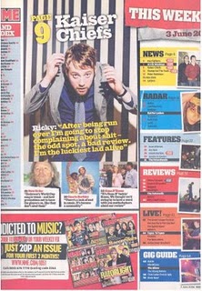
BRIGHT COLOURS! this contents page  from the NME magazine is as we can see is very busy jam packed with images and loads of texts. we can obvious tell that the target audience is for a younger ages (16-25). by using the bright colours it makes the page more eye-catching and interesting . they also use a range of different colours , relating to different sections of the magazines . the colourful nature of this contents page subverts NME's original identity , they usually stick to minium colours which are usually dark colours. 
The main image is of the member from the Kaiser Chiefs (Ricky) he is in the centre of the page but it is not a large portion of the page , his body posture and facial expression is very different as he almost hunched over and looking up at the camera , im not sure of what this conotes but it is very different to what NME usually portrays . the images on the side next to subheadings are very important , it draws the audience  attention to what is going on with the magazine .

Contents Page Analysis (Vibe)


This contents page is very simple . The colour selection is just of dark black and grey tones,giving off a silence and concentrated atmosphere . The main image is used as the foreground and the background, VIBE editors have chosen Mavado to be on the front cover , Mavado being a gangster icon in the music industry .He is wearing chains/watches/bracelets wich relates to the gangster culture , his posture and stance is very 'Boss' like , Mavado is in control , his head titled to the right lookin directly at the camera installs that power and 'Boss' image . The sub headings are very simple also there is not much to go on , which also makes the magazine seem more sophisticated and to the point , aiming at a target audience of around 18-25.

Wednesday, 16 February 2011

Article

Blazing threw the speakers are new upcoming duet *Name not decided yet* .Comming  from the cold streets of north west , the two are proving them self to succesulf young artists. The pair have worked together collaberating the smooth tunes of RNB and the powerful lyrics for grime to create something unique and special.’We made it ‘ being there upcomming single is climbing its way up the uk charts ,  As weeks fly by , *name* are soaring above the sky .
Lets see if *Name* really have ‘made it’ ? In this weeks edition of Rhythm and Grime we get a special insight into the duets life , there struggles and battles in the music industry,Rhythm and Grime get the truth on how life is like to go from having nothing to having it all.
How did you both meet?
Female Artist: (Giggleing) Funnily enough we both met at a youth club in monks park . orginally hating each other  , we resolved our difference and our friendship grew stronger. Having the same aspirations and family background our frienship was so easy flowing , we could relate to each other in a way no one could.We decided to combine our talents and work together for a better future out of the streets . *Name* and i both knew we wanted to get out of the gritty cold council estates . We where destined for a better striving in a persuit for success.
How was life befor you began to make music ?
 Male Artist : Well what can i say , lifes always been a struggle , some days have been extremly difficult . Not having food on the table , money in my pocket . My parents seperated befor i was born so i never really met my father . Growning up in a single parent family with no father figure was a big battle in my life that has made me the successful young man i am today and i couldnt have done it with out my mums love and intense support.
Female Artist : I couldnt agree more *name* . comming from the same council estate , we have had similar upbringing , unsure of when your next hot meal will be , or when you going to have money to get new shoes . Going threw my teens experimenting with drugs and alcohol after the death of my mum , but again agreeing with *name* it has made me who i am today , stronger individual . (Laughing) WE MADE IT !!
What artist's have influenced you ?
Female : ive been influenced by artist such as Alicia Keys , Beyonce , K.Michelle . However my greatest influence is Mary J Blige she is a true insparation to women and young people as a whole .


Male : my influences have been men like Notorise BIG , Tupac , Giggs , Devlin .

Tuesday, 15 February 2011

Front cover Analysis


In the main image we can see that , Leona lewis has been chosen as the model for the front cover , being a successful winner of the well known television show X-Factor this will grab major media and public attention .  in this shot Leona is biting her thumb , this sort of gesture conotes a sexual nature, this also appeals to a male audience. Looking at her facial expression she is look directly at the camera , this creates the idea that she is looking out at her audience almost seducing them into the magazine. She is dressed in plain black with silver detail on the neckline , the simplicity of her clothing then brings the initial focus on her face and her facial expressions . 

Focusing on the mast head "BLENDER" it is a bright orange colour , which immediately grabs the audiences attention , it conotes a fun exciting feel to the magazine. The mast head is placed behind the main image reenforcing the focus of the front cover to the main image .

The main cover line  'Leona Lewis' is in a bold font to make it stand out and obvious to the audience , the fact they have just used her name as the main cover line shows that she is the main focus of this particular issue of the magazine.

Looking at the additional cover lines such as ' Whats Perez shaving ? P96.' this kind of text is usually seen in gossip magazine and not music magazines which is a clever approach to try and sell the magazine 

Friday, 11 February 2011

Front cover Analysis (Lil Wayne & Baby)

Observing the Main image we are presented with rap idols Lil wayne and Baby (Birdman) who are apart of the rap/urban celebrity culture ,which is seen as a competitive industry. Both artist are wearing excessive amounts of jewellery , virtually covered in bling this conotes the idea of wealth and luxurious life style. The men are both standing topless witch appeals to a female audience and also a male audience as it is Homo-erotic. The large surface area of tattoos covering there bodies instantly depicts an image of masculinity and ruggedness, it can also justify there individuality and independent persona.  Concentrating on Lil Waynes hands , we see he is holding a red bandana/balaclava also his hat has aspects of red patterns, babys chain has  hints of red and his hat is in a red colour , connoting the idea of power and superiority

Focusing on The Background , we can make out the image of a run down broken house , this contrast there physically appearance of being glamourous and living a luxury filled life . The broken house is symbolic of there past and where they came from..showing there struggle relating to the idea of 'Survival of the fittest'.

The Mast Head is in large font with a red background , using the colour red carrys on the idea of power and supremacy. The letters 'XXL' are incrusted with diamonds , this relates to the physical appearance of Baby and Lil Wayne , linking to the bling culture.

Examining the Puff ,'Decade of Dominance'relates to the artists image and the competitive nature of the rap game , also use of the word 'Dominance' conotes the idea of achieving control in the rap game .


Thursday, 10 February 2011

Front cover Analysis (Usher)

In the Main image we see the world famous RNB vocalist usher , the image is at a low angle witch depicts the idea of superiority and power . ushers pose is very eye catching , it appears that he is portraying an awful hand gesture .However it is his ring finger , with is dressed in a diamond incrusted  wedding ring . also looking at his attire  he is dressed in casual and neutral colours this conotes an image of class and simplicity adding to idea of simplicity he is wearing jus a watch and sunglasses . in addition to the sunglasses , they connote the idea of mysteriousness and again the superior nature of the image. Furthermore , ushers posture and his body language connects to the superior feeling , his head is tilted and he seems to be lent back , looking kool and collected . however the tilt of his head depicts arrogance and supercilious nature. 
Lastly the positioning of usher , he is places infront of the mast head showing that he is possibly more important and interesting , the mast head loosing its importance and the focus is all on usher .

Looking at the Mast head we see the word 'VIBE' in bold bright blue font this relates to the actual genre RNB (rythme and blues) blue is a colour that is usually linked with calm and cool feelings , however it is bright and eye catching drawing the reader to the magazine . Also blue is a unisex colour witch appeals to both male and female readers.

The Background image is vaguely seen , but it seems to be a cream/off white coloured wall , it just enhances the focus on usher and drawing the reader to the magazine.

 The Main cover line  reads 'USHER The king is back HES NO1 and married with a vengeance'  the words 'Usher ... Hes NO1' this is to attract readers to buy the magazine. also the 'Married with a vengeance' could link to the wedding ring in the main image.

observing the Additional cover lines the word 'SWAGGER' is written diagonally across lower left hand side of the front cover , the font used is in a graffiti style wich relates to the RNB street culture and the colour red could signify the idea of power and dominance as it stands out and contrast with the colour scheme on the front page.


Friday, 4 February 2011

Questionnaire

Please complete this questionnaire.

1. What gender are you?
Male                      Female                 Prefer not to say

2. How old are you?
16-18                     19-21

3. What ethnicity are you?
White British/Irish
Black British/Caribbean/African
Mixed Race
Asian British/Pakistani
Asian British/Indian/Bengali
Asian British/Oriental
Other

4. What are your hobbies? (Choose no more than 2)
Playing sports                    Shopping             Playing videogames           Raving/Clubbing
Drawing               Reading               Other

5. What genre of music do you listen to?
R&B                       HipHop                 Funky House             Rock and roll               Grime  
Other
6. When purchasing a music magazine , how much are you willing to spend?
£1-£2                     £3-£4                     £5 or more

7. What kind of features would you be drawn to in a music magazine?
Gossip                  Fashion                                Celebrity Interviews            Quizzes’ and  Games
Horoscopes            Other

8. What freebies would you like in a music magazine?
CD/Mix tape                      Mobile phone/iPod case              Jewellery
Cosmetic samples            Other
9. How often do you buy music magazine?

Regularly/daily           Weekly                Monthly            Rarely                Never

10. Who are your favour artist or bands ?

........................................................................................................................................................................................................................................................................................................................................................................................................................................................................................................................................................................................................................................................................................................